Showing posts with label Colorcast Designs DT. Show all posts

Tuesday, March 14, 2017

Project Life Insert | Color Cast Designs

Hello Everyone and welcome to the blog today.

I am going to be sharing an insert with you today. This insert will go right in the middle of week 6 and I am totally okay with that. Sometimes I am not a fan of adding inserts in the middle of a spread because I've worked so hard on making sure that your spread all matches and is cohesive. But I am trying to move on and just roll with it.

Okay, let's get started. This insert is all about Katelyn's Robotics Competition that happened that weekend. She has been looking forward to this for a long time and so was I.

Here is what the front side looks like.


Whenever I add in an insert I will usually use this design G page protector from Becky Higgins.
It is 10x12 and it is large enough to get a good amount of photos without having to do a full page.


This title card was super fun to put together. I started with this pink Weekend acrylic piece from Color Cast Designs. This one is from the February release and you can find it in her shop HERE.

I knew that I wanted to add the word weekend over and over again somehow on this card. I played around with a bunch of different ideas in photoshop. I ended up going with repeating the word weekend along the bottom of the big Weekend piece. I added that fun wheel along with a few other embellishments.


The color scheme for this insert was this nice blue color, and this darker pink color. I picked out this nice circle blue patterened paper and added a smaller photo to the top. This photo is of Katelyn when she and her teammate were in the ring with their robot. Speaking of Robots the photo next to is of their robot named Nikki. Isn't she just the cutest thing ever ! The girls were super proud of their accomplishments and had a great day.


This photo I kind of had to beg and plead. I pulled her and Nikki over to a white wall at the school and I said " Just stand still so I can get a photo. " " You will thank me later."

I added that gold EPIC word onto the photo using my stapler.


During some downtime in between rounds Katelyn and I went in the back of the school and she spent some time playing around and practicing with her robot. I bent down and snapped this photo.


This is the last card on the front side that I want to show you. This card was inspired by the circle chipboard piece that says Top Five. I thought it would be fun to ask Katelyn what her top five moments were. I had such a hard time finding a 4x6 card for this insert but went with this one that has some faux stitching on the side. I added some fun embellishments in a cluster towards the top. The robot was something I found for free online and printed  him out on some vellum. I added a brad to keep him on the card.


Let's move on to the back side of the insert.


This side has a few more photo and lots of words.


This first journaling card is talking about Balance. One of the ways to score points is to get both of the teams robots onto the ramp and to have it balanced. You get 25 points for it and so it is a HUGE deal. I used this gold Balance word and a pop of pink on this card.


This was another photo of when we were passing the time in our downtime. Katelyn thought is was so funny to make her robot grab the Pringles in her hands and bring them to me. I added a digital stamp and then added a cork piece underneath.


I had lots to say so I added this 4x6 journaling card. I needed something with a lot of white space for my story and this one was perfect with its red/pink arrows on the bottom.


There was a lot of orange in the photos so I decided to add some in on this card. I added a word strip on the top and then that circle geotag on the bottom. I wanted to spell out robotics on the bottom of the card and then I added the word competition to the label that I tucked underneath some of the letters.


Here is one last look at the back side of my insert. The bottom photo is of the ring where the two teams would compete. Katelyn is driving.


That is it for me today. Thanks for coming everyone. I do have a Youtube process video for this one if your interested. You can find it here. Have a great day.

Here is the link to the video.

Wednesday, February 22, 2017

Winter Vibes 2015 | Project Life | Color Cast Designs

Hi there everyone !

I am going to be sharing a fun Winter themed page with you all today. These photos are from a year and and a half ago when we went and visited my parents. They have snow during the winter and we do not here in California. So getting to go sledding is a big deal to my kids.

Let's get started shall we. Here is a look at the whole spread.


Let's begin with my title card here. I went with a blue, pink, and grey color scheme to match my photos. This 4x6 card with the pink strip on it was perfect for using it as my title card. I needed something that had a lot of white space to go along with my blue Star clear pieces. They are from a package I got a few years ago from Heidi Swapp. I also needed something simple so that my Winter Vibes piece would stand out. The white acrylic piece is from Color Cast Designs and can be found in her shop. Isn't it awesome ?!!!!!


Last Fall at the Scrapbook Expo I had picked up this Becky Higgins Value Kit that was the perfect colors for these photos. It was also winter themed. I picked out this pale blue snowflake card as a starting point for this journaling card. I added some of the fun stickers from my recent Studio Calico Kit as well as some other embellishments. 


This card is also from the Value Kit. It is called Winter and it was designed by one of my favorites, Heidi Swapp.

I added that cold word sticker as well as a few other embellishments to make a cluster on the bottom of the journaling card. It holds some facts about the kids's snow day and I also added in a fun quote from one of the kids. They asked how cold it was and one of them answered " It is 15 degrees below COLD".


Here is a closer look at a photo of Katelyn making and throwing snow balls and a journaling/filler card with Maddie and Noah in the photo. I added one of those gorgeous pink wood stars from the Studio Calico kit. I love those things.


That bottom left photo is of my dad and Noah going up and around the big rock in their backyard. When they built their house there was a huge granite rock in the backyard. They left it there and in the winter time it is a great kids sledding hill. I added a digital stamp from Kellie Stamps and also some wood phrase stickers and another pink wood star. 


Let's move on to the right side. But first I want to point out this left top photo. It is soooo hard to see in the photo of the photo but when they were outside playing in the snow it was snowing. It was so gorgeous that I sat and played with my camera for a good 15 or so minutes trying to get a photo of the snow. 

The bottom right photo is a good shot of the big rock. It is to the left of the people and it covered on the top with snow. So many fun memories on that rock. 


This card came together as an idea. I had that wood veneer piece from Color Cast Designs ( still available in her shop) that I knew I had to use to say something about the snow. I had that black flakes sticker that actually said snow flakes in the cursive writing. I cut off the snow and used some black letters to spell out snow. Underneath the O I added a pink vellum snowflake. The blue card is from a Studio Calico kit. 


Here is a look at some of the right side of my spread.


This pink journaling card is from the Value Kit as well. I needed to pull in some pinks over on this side and so this was perfect.


Katelyn was trying to attempt to make a snow man but it was super cold that day and the snow would not stick together. I added some journaling onto my photo and also the word winter from an Ali Edwards Digital set.


More sledding photos of the kids. They had so much fun that day. My parents live on a hilled street and have a big rock wall on one side of their yard. The kids decided to use it as a sledding hill.


One last look. The bottom right photo of Maddie was so funny to watch. She had gotten down the hill before her sled did and boy did we have a laugh about it.


I am sure glad that I got to document our fun snow day and get those stories told. I thank you for coming to the blog today. I hope that you have found some inspiration and will get those snow photos scrapped.

Until next time.

*** I did film a process video for this one and will get it up in the next week to my Youtube channel. I am currently not feeling so great and will be resting up to hopefully get some more photos scrapped. ****

Monday, February 6, 2017

Project Life January Review

Hi guys !

I am back for another blog post today. I am going to share a fun pocket page spread all about some current things that are going on. 

These pages started to come together thanks to some product inspiration. I wanted to tell some fun stories using my products. I will get into that more as we go along. 

Here is what the whole project looks like. 


Making a title card was very important for this spread. I used a 4x6 card from an older Studio Calico kit. I have had these Ali Edwards ( I am pretty sure they are from Ali) Month stamps forever and thought that I would stamp January on the card. After that I also added that currently strip and then I spelled our FAV.

Typically my spreads are photo driven. I usually start with my photos and then use them to find common colors and so on. This time I started with some products that I have wanted to use and went from there.


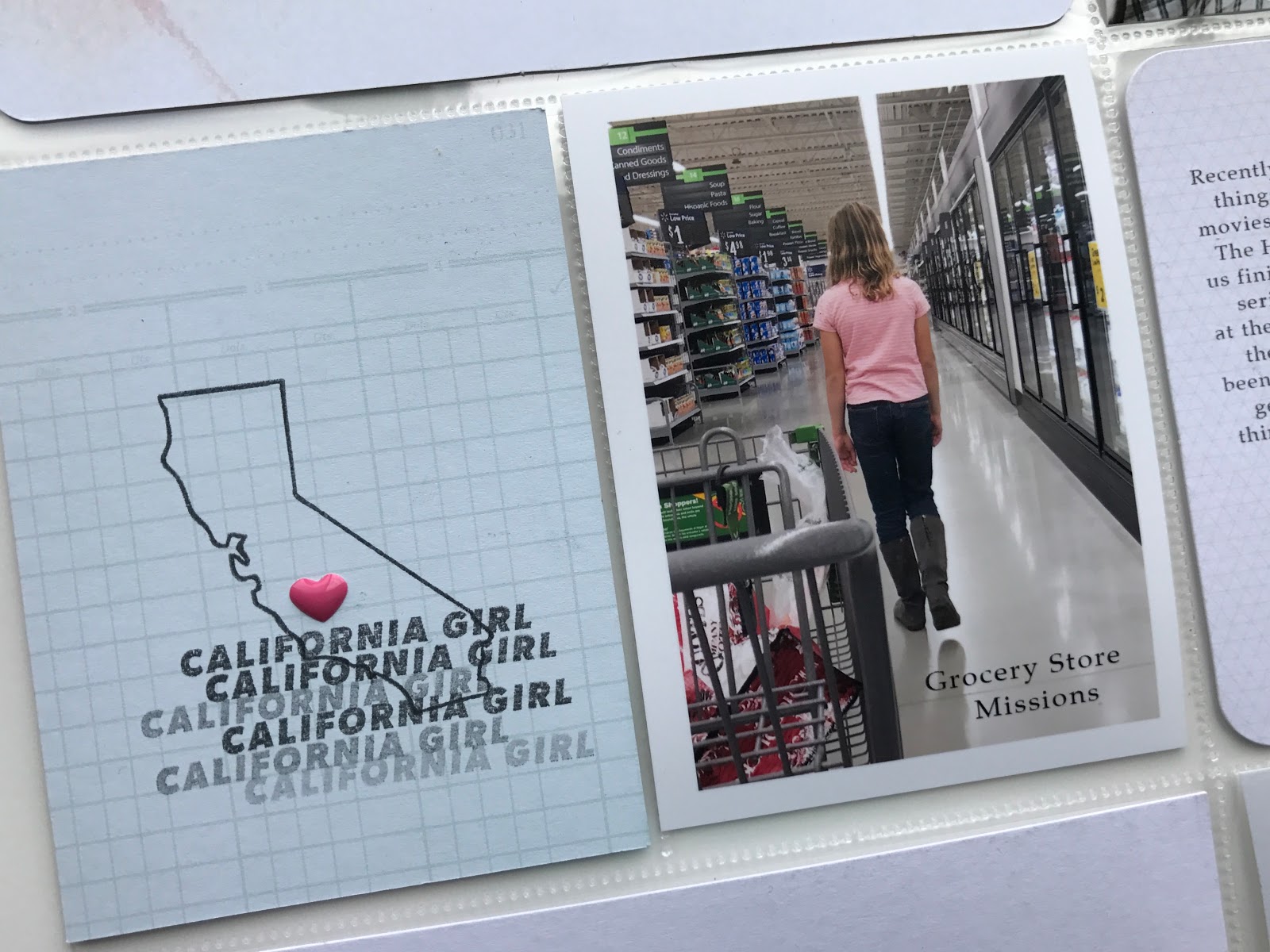
Since I am a recent California transplant I have been on the look out for California supplies. I picked up this fun California stamp from Kelly Purkey this past fall at the scrapbook expo.

I decided that I wanted to create a filler card using this stamp set. I stamped the Cali. state outline first and then I added the California girl stamp over top, stamping it repeatedly. I finished it out with a pink heart over where we are living.

The photo next it is about a small story that I have been meaning to add into my PL album for a while. I snapped a photo of her at the Grocery Store and added Grocery Store Missions. Long Story short : Whenever the kids come with me to the store I assign them " Missions". They are given a certain food to get and then I send off a few kids to go and fetch the item and then come back to the cart. The kids love it and it shortens our shopping time.


These few pages hold lots of fun stories and favorites. This story is about the messes we are making and how I want to make more messes even though my clean freak side is saying oh no you don't !


Here is a close up of the bottom part of the left side.


Next up are these middle pockets. I just love that tv tuned in card. We are a tv loving family. In the evenings we as a family have been working our way through the Hobbit movies. I found an image from the internet and printed out that Hobbit photo.


These wooden circles are among my favorite embellishments lately. They are from Color Cast Designs and the set is called 104 % Tired and the whole set is me to a T. I used this one that says Namastay in bed. Seriously, that is me lately. The weather has been dark, dreary, and rainy for most of January so it has been hard to have motivation to get things done. Oh and can I just say that trying to take a decent photo of me in bed and not have it look weird and akward was HARD. But I wanted a photo to go along with that wooden circle. Let's just leave it at that. HA HA.


Here is the right side of my spread. More stories.


This top card was inspired by another one of these wood circles. This one says 104 % tired and so I wanted to make it the O in Mom. So I added my journaling on the top of the card and added the MOM to the bottom. Yes, I know the words on the bottom of this card are upside down. I wanted the blue on the bottom and went for it.


This next photo and journaling card is another one that the products were the inspiration. This set is another one from Color Cast Designs. I loved the color and the wood piece that has a soda bottle on it. So I have to admit that I bought this Dr. Pepper bottle so that I could take a photo.


The last photo is one from the last weekend in Jan. We have spent a lot of time outside and at the park looking over the river that has been flowing. The weekend stamp is a digital brush from one of Paislee Press Pocket Guides.

I made sure to spread out my wood embellishments to make it flow more.


This page protector that is on the right side is one from Simple Stories and it has 3 4x6 pockets and then a 6x12 pocket. I have another project to go on the other side of this one and so I needed a 6x12 either photo or a patterned paper. I decided to print off this photo as a 6x8 size and add a journaling card on the bottom.


I chose this card that has this green bird on it to try and tie in some of the greens in my photos. This journaling card has a lot of tid bits about our favorites right now and of what has been happening in January. On the bottom of the card I added a few embellishments. This time I chose to add a few circle pieces and I love how simple but nice it looks.


Okay folks that is it for me in this blog post. I am so happy that these fun products have inspired me to get these stories told.

Please check out the Color Cast Design shop. It is full of wonderful inspiring products to get your stories told.

I also filmed a Youtube process video that will be up soon to my channel. So stay tuned for that and more Project Life blog posts to come hopefully this week. I have week 4 all done and it turned out great. Here is a link to my channel if you are interested.

Thanks everyone for coming ! 

Thursday, January 26, 2017

A Beach Day | Project Life | Color Cast Designs

Happy Thursday everyone !

I am back with another Project Life spread to share with you. This one is all about our adventure on Martin Luther King Day. We decided at 11 am that morning to pack up the car and drive down to the beach. We had such a good time.

Typically I do my spreads weekly with a few events in between. I decided to add in this spread about going to the beach and also a spread about us going to Disneyland the previous week. That left only a handful of regular weekly photos. Instead of trying to add in things, stretch the photos I had, and or take more photos. I combined week 2 and 3 together.

I want to be clear about Project Life. There are no rules. You can do it however you want to. You can add whatever into those wonderful pockets and it will be ok. I am so happy how January is turning out. This year I do not want to stress about my scrapbooking. It is not supposed to stressful. It is supposed to be joyful and creative and fun. So that is what I am making it to be.

Okay let's get to the good stuff. Here is a look at the whole spread.


One other thing I want to point out about this spread is the page protector on the left side. I went with design G this time. It was so fun to take a break from the normal.


I have been wanting to use this card from a Heidi Swapp value kit for a while now. This page was it. I added in the words " beach days"  under the yes to. It was perfect because we did say yes to a beach day. I added a few embellishments on the card and called it done.


When I go about putting my spreads together I like to look through my embellishment stash, well more like baskets, and pull stuff out to use. This star was the perfect color combo and I had the idea to try and add it to a multiple of photos. ** I have a youtube video about how I put this whole spread together if you are interested. **

Link to the video

I added it to the bottom right photo first with my tiny attacher. Then cut the rest off with some scissors. I did the same technique to add it to the other two photos.


I wanted to break up my photos with journaling cards. I have this one down at the bottom that has some journaling on it. I added a few pieces of embellishments to the corner. That black acrylic piece is from Color Cast Designs January set. The day sure was awesome.


On the top part of the page I added in a photo of the fog that we drove thru that morning. Also I added in this filler card. That gold piece is from Studio Calico kit and it was the perfect saying. The beach is my happy place.


Let's move over to the right side.


I took this great photo of noah in the waves that I wanted to make big. Before I printed it out I added a few digital brushes to the top white space in the photo.


We hiked around the sand dunes as well as built sand castles.


I chose to bring in some of this pretty pink/orange color. I added this pinkish card around the photos to try and break up the photos.


This white heart piece is an acrylic from Color Cast Designs. I thought that it would add some interest to add some patterned paper underneath that middle heart. So I found some bluish paper and love how it turned out.


That is a wrap. Thank you all for coming today. I hope that you have perhaps found some inspiration and are able to get scrappy this weekend.

I have a youtube video up on my channel that walks you through how this spread came together. Here is a link to the video.

Beach Day Process Video